Over the past few weeks, I’ve been genuinely touched by the reactions to my previous article about failures (the previous article is available here). I wasn’t sure how people would respond to a post built entirely around my mistakes, but the comments, the critiques, and the thoughtful discussions that followed were far richer than anything I expected. It reminded me why I enjoy this community so much: there’s a real willingness here to look closely, to question, to share experience, and to help each other grow.
What struck me most was how differently people saw the same images. Some of you noticed things I had completely overlooked; others found value in frames I had written off long ago. That diversity of perspective is incredibly refreshing. It pushes me to rethink my assumptions, to articulate my choices more clearly, and to stay open to interpretations beyond my own.
So for this follow‑up, I thought it would be interesting to change the format.
Instead of explaining why I consider the next set of images “failures,” I’m going to keep my thoughts to myself for now. I’ll simply present the photos — no commentary, no technical breakdowns, no hints — and invite you to share your impressions first. What catches your eye? What feels off? What would you have done differently? What story do you see, or wish you could see?
After a few days (or once a good number of comments come in), I’ll post my analysis in the comment section so we can compare perspectives. Maybe we’ll agree, maybe we won’t — but that’s exactly the point. Photography isn’t a test with right or wrong answers. It’s a conversation. And sometimes the most valuable part of that conversation comes from seeing how others interpret the same frame.
So here we go: another batch of my “failures.”
This time, your turn first.


Thank you again for the incredible engagement on the previous article — it genuinely pushed me to look at my work with fresh eyes. I’m hoping this new format will spark the same kind of thoughtful discussion. Feel free to be honest, precise or even blunt if needed; I’m not looking for praise, I’m looking to learn!
I’ll share my comments in the thread, and once I’ve gathered the new insights from this exercise and the earlier articles, I’ll prepare another post showing the revised versions. I’m genuinely excited to see how your perspectives shape the next steps of this journey.
Cheers,
Alex
Share this post:


Comments
David Brancaleone on Reflecting on a few of my failures Part II — Your Turn First
Comment posted: 17/02/2026
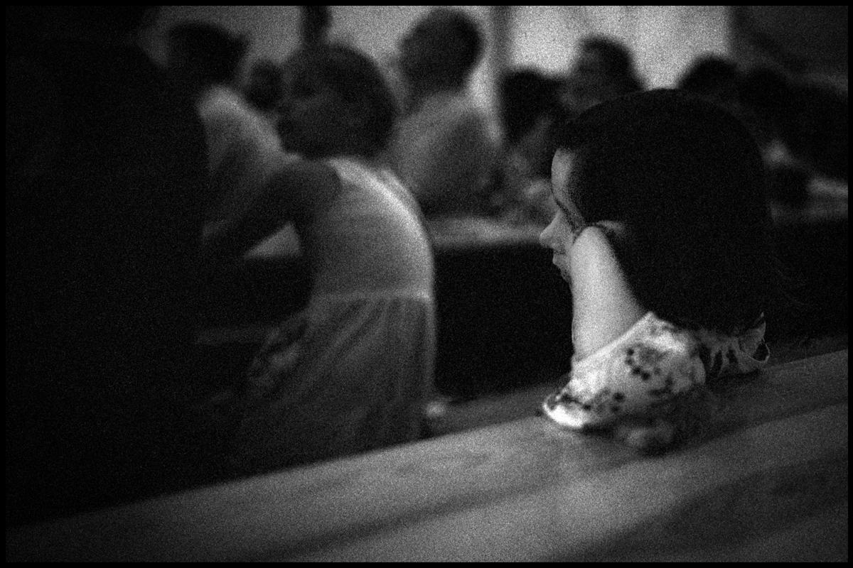
No. 1 reveals a portrait of what Michael Fried calls «absorption», whether in painting or in photography it doesn't matter. Absorption refers to when someone is reflecting or concentrating instead of looking back, exchanging glances. The light helps capture this frame of mind, frames it, you could say.
I might crop the left side until where nothing detracts my gaze. Also, the all black bottom of the image I find a distraction or maybe it creates an imbalance with the top of the hat almost too close to the top edge?
N. 0 is placed above and unnumbered, striking as it is. Unworldly, though part of a social context and timeless. I like everything about it. The tonal range. The way the child is positioned to the right, contravening unwritten and rigid rules perhaps, but allowing the eye to roam around the room. No. 2 I would discount because of the lighting and flare, if that's the correct term. The third portrait speaks to me, despite the oddity of the background. Or is it just breaking my conventional expectations? I suspect it is.
The fifth one is also of interest to me. Why? The shadows are meaningful, somehow. Convey a sense of presence and absence, instead of just casting a different tone from an obstruction to light or emphasizing an object with contrast.
As for the others, quite frankly, those do not interest me, but I am struggling to justify this observation.
What I get from this and the previous post, is my learning to see as an ongoing process of educating oneself by seeing what other photographers are doing and, mutual surprise as a result. Thanks, I think your work will help me a lot with my own ongoing portrait project.
What I am thinking is probably dead obvious, but not to me:
There's the instant which still manages to compress time before the extended time of reflection and maybe that uncompressed reflection will be stored in memory and act as an influence next time.
Comment posted: 17/02/2026
Scott Ferguson on Reflecting on a few of my failures Part II — Your Turn First
Comment posted: 17/02/2026
First, I salute you for both bravery and innovation in making posts about the photos you think of as failures. It makes 35mmc a more interesting place when we can share ideas like this, and maybe it makes it a little safer for the rest of us to share the things we're trying to do better as opposed to just trotting out our 'greatest hits'. As someone who really admires your photography, I even find your 'failures' a little intimidating, because they usually have some element that is very interesting, even if not perfectly realized in every shot.
On to the photos, my quick first impressions from this batch...
Featured Image: great mood, nice composition, a very "Alexandre Kreisman" photo if it weren't so dark and grainy. Your photos are usually so impeccable technically, that I wonder what happened here? Did you miscalculate exposure, or try shooting a moment that was cool, knowing you were on or a little past the edge? Curious what camera and lens you used here?
1 -- I think this is really close to a very nice moment, but the range of the highlights vs the shadows feels a little extreme and perhaps a little unflattering on the subject's skin and hair, noting that it was a digital shot. Shooting on film, perhaps with a vintage Leica lens might have gotten a softer, nicer look.
2. As someone who is still learning how to shoot effectively in backlit settings, I'm sympathetic. I have too many shots with this kind of washed out look. I also think the energy kind of dissipates from this frame with the guitarist looking off screen away from the lens and the microphone and guitar neck all askew.
3. Another digital shot with the same lens that seems to want to show every pore. I think the costume is quite interesting and the pose is dramatic, and I like the drop off to the indistinct brick wall, but again, the combination of the 35 lux and a digital sensor would probably not be my top choice for doing portraits.
4. This shot feels really close to being a great photo, but I think it feels like maybe you are trying to do too many things at once and maybe not serving any of them quite well enough. I love the strange lines and curves of the tall lamp post and its shadow that are almost contained in the photo, but miss the top of the lamp post, I also love the giant teddy bear and the stroller and the people taking photos but to get almost the full lamp post in the frame, we are a little too far from that action to figure out what is going on -- is that a small child at the feet of the bear? And I love the architecture of the public square, but the bear is kind of blocking one of the major buildings. Perhaps this could have been two or three very cool shots?
5. I'd be reasonably happy with this shot if I took it. Interesting almost abstract study of movement and shadow.
6. Again, I'd probably be pretty happy with this shot -- it has a definite mood and you get a strong feel for the personality of the person and it kind of tells a bit of a story, possibly not a happy one. I'm on the fence if I would have tried to get a little more light on the subject's single visible eye, but there's something quite deliberate about the way he's wearing his hair that feels like a statement in itself, so I may have left it as you have.
7. This feels like a fun moment to capture, but perhaps from a different spot a little less perpendicular to the subjects. The setting and the costumes and the little shared moment between the two people are all great, but I'd like to see a little or a lot more of their faces & expressions -- maybe not full frontal, but also not so far profile that the 2nd person's face is more or less blocked. I think the 240 35mm lux combo works better here in softer light that the earlier examples with that lens.
8. Was this taken with the 240? (It says 250...) If so, I think this might be the best digital portrait shot from this post for me, perhaps because you are shooting with the 50mm Summicron? The main subject looks pretty good here, and we don't see the slightly harsh glare exposing every little detail of her skin like from the earlier shots with the 35mm lux. I suppose the combination of the up angle and some messiness in the background might be things to improve on, but otherwise I like this shot.
Thanks again Alexandre for sharing these, and all of my comments are coming from a place of admiration and trying to be constructive. I hope they are useful to you.
All best,
s
Comment posted: 17/02/2026
Gary Smith on Reflecting on a few of my failures Part II — Your Turn First
Comment posted: 17/02/2026
Thanks for another insightful post.
Comment posted: 17/02/2026
Erik Brammer on Reflecting on a few of my failures Part II — Your Turn First
Comment posted: 17/02/2026
Thanks a lot for sharing these.
The featured image!!
#2: I love these halos.
#4: The top of the composition is, well, unconventional :-) But the little child and the feet of the bear is super!
#5: Wonderful framing and so much to imagine outside of the frame.
Cheers,
Erik
Comment posted: 17/02/2026
Alexandre Kreisman on Reflecting on a few of my failures Part II — Your Turn First
Comment posted: 17/02/2026
Thank you for commenting and giving me your thoughts, I guess the general consensus is that these pictures as they stand are ok.
To me, they are not. They have flaws that makes them "reject" in my opinion. Now, some of these shots are quite old, also I missed the technical part to control what I wanted.
But there is more.
I will answer to each and everyone of you in time, May I suggest, you take the time to look at them, imagine it's your image and then tell me what's wrong with them, give me some advice, your thoughts .....
Thank you very much!
Cheers
Alex
Graham Line on Reflecting on a few of my failures Part II — Your Turn First
Comment posted: 17/02/2026
Too many of the workshops I attended were exercises in self-promotion and one-upmanship. Advice from other working photographers was much more helpful.
Comment posted: 17/02/2026
David Hume on Reflecting on a few of my failures Part II — Your Turn First
Comment posted: 17/02/2026
Of these, I'd quickly offer the following:
#1 Feature image - Love the grain, mood and symmetry of two girls. Would just crop up from bottom left and change aspect ratio to lessen the black area on the left. Strongest image.
#2 Girl in hat - nice, just needs more air at the top to give her some space.
#3 Guitar Man - nice, just darken and increase contrast.
#4 Second hat lady - messy in the hat, can't be saved.
#5 Lamp post - angle of post is jarring, but not a strong shot anyway.
And it sort of follows from there, really. I think the first three are worth pursuing, but after that they fall off. Best just walk away, I'd say.
Now, this might sound a bit bleak or defeatist, but I guess if your intention is to differentiate between quality, sometimes there is nothing wrong with a shot, it's just not that great, and if there's nothing that really grabs you it can be time to move on. Another way of putting this would be to go back to the initial premise that if I were judging these in a category "Black and White" for example, I'd mark the top three significantly higher than the others.
I guess would remark on your comment that there are flaws that make you reject them. I think I would say to that that taking away the flaws does not of itself make a good shot; it's just a shot without flaws.
So I hope this helps, and yes, I do think that doing this kind of exercise is very worthwhile and adds to the community here, so thanks for doing it again. I'm a bit hesitant about my comment lest it sound unduly negative, but I guess you did phrase the request as a finding of fault, so I hope what I've said is useful.
Cheers
Comment posted: 17/02/2026
Michael Murray on Reflecting on a few of my failures Part II — Your Turn First
Comment posted: 19/02/2026
Title shot: needs more light. 2-3 stops, possibly. At first, I warmed to the grain, but upon reflection, this moment is delicate, even angelic, and the brazen grain offsets that esthetic.
1. Again, too dark. I also once found those crushed blacks dramatic, but now I see laziness. Assuming you had more than a split second to compose and expose, there could have been more story to this subject. Also, there are better ways to isolate the subject than rendering the entire surroundings invisible. One thing I try to do is keep my settings to a stop or two over ambient light, so if I have to shoot fast, at least I know I've got a chance at an acceptable exposure.
3. The flare is somewhat suitable to the mood here, but the contrast is so flat as a result. Maybe you could have positioned the subject's head or body between you and that large light source, not only reducing flare, but also amping the drama with some major backlighting.
3. This portrait and the portrait in shot 1 could use the same adjustment from cinematography. I'm sure you've noticed in films the subject of a scene, especially in closeups, is almost always lit from the side. This way, their face is in shadow while the side (cheek, jaw, hair) is bright. A more pleasing and dramatic way to shot high contrast portraits.
4. Simple: get closer. Close and low can make the bear more prominent, and the child more noticeable. I totally understand the restraint though t; I also don't run up to strangers taking pictures of their kids point blank!
5. and 7. I don't see much potential in these scenes.
6. The subject is engaging with the shot, so engage with him. Pose him in a different way (looking camera left, upper hand draped over knee, perhaps), or ask him to drop the pose and simply look at you. Great potential in this shot, but the peace sign sort of breaks the 4th wall.
8. I have only one gripe here, and it's the camera angle. This subject is confidently individualistic, even defiantly independent. Shooting here straight on, or perhaps even slightly downward, could evoke that spirit and character more saliently.
Thanks, Alex! Can't wait to hear what the circumstances of each shot were and what you wish you would have done differently.
Comment posted: 19/02/2026
Alexandre Kreisman on Reflecting on a few of my failures Part II — Your Turn First
Comment posted: 22/02/2026
0# I miss calculated the light, well in reality to have her perfect I should have taken her at 1/4th of a sec, which I wasn't ready for. It was shot in a dark place at 1/15th, hoping that with a bit more time in the developper that would save it. Actually, I printed that picture on my enlarger and got a lot more, so I'll try again with another scanning technique. The image was taken with an MA and the 35 Lux
1# Complete miscalculation of the highlights + the 2 bright spots in the right corner attracts the eye. The image is too dark and at the same time I've blown the highlights.
2# Love the blur, hate the mic, missing contrast, the face is too dark
3# When in full size, the Highlights are blown and there is too much detail on the face + maybe another crop.
4# Miss the top of the Lamp post. I wanted to have 3 scales in the picture: The Lamp, the Bear and the child. maybe with a 21 and not so far .... I wanted to have the shadows also.
5# Love it, I should have kneeled and take the shot farther and in direct opposite of the lady and her shadow + miscalculation off the light by 1 stop
6# Hate the crop, there is much more to the image in it's original format + he needs to stand out completely
7# Every year there is a Steampunk festival. 10 years ago, if you went early you could photograph people. At 10 am, each person had 10 photographers around them, so you needed to arrive early and got maybe an hour to shoot. What you do not see in this frame is another photographer taking a picture of them. I've tried a lot of time different cropping to have a decent photo, maybe now will I try. I'm not fan also of the colors and the nuance I get from this one.
8# Too dark, her eyes are beautiful, she doesn't stand out and need I believe a vignette + some dodging and burning, I'll try to have her again !
Thank you everyone who participated in this exercise! you taught me a lot and the return was perfect!
Cheers
Alex